Fractul Variable
Fall 2024
Typography Microsite, Web Design


Overview
Fractul Variable is a contemporary geometric sans serif that draws from architectural principles and modernist design philosophy. This microsite prototype showcases the typeface's distinctive features—including its generous x-height, bold geometric construction, and sharp angular details. Designed for creative professionals, design students, and typography enthusiasts, the site demonstrates the font's versatility through moving type videos and includes calls-to-action for font purchase and newsletter signup. The project targets audiences who follow industry leaders like Collins and Type01.
Design Approach
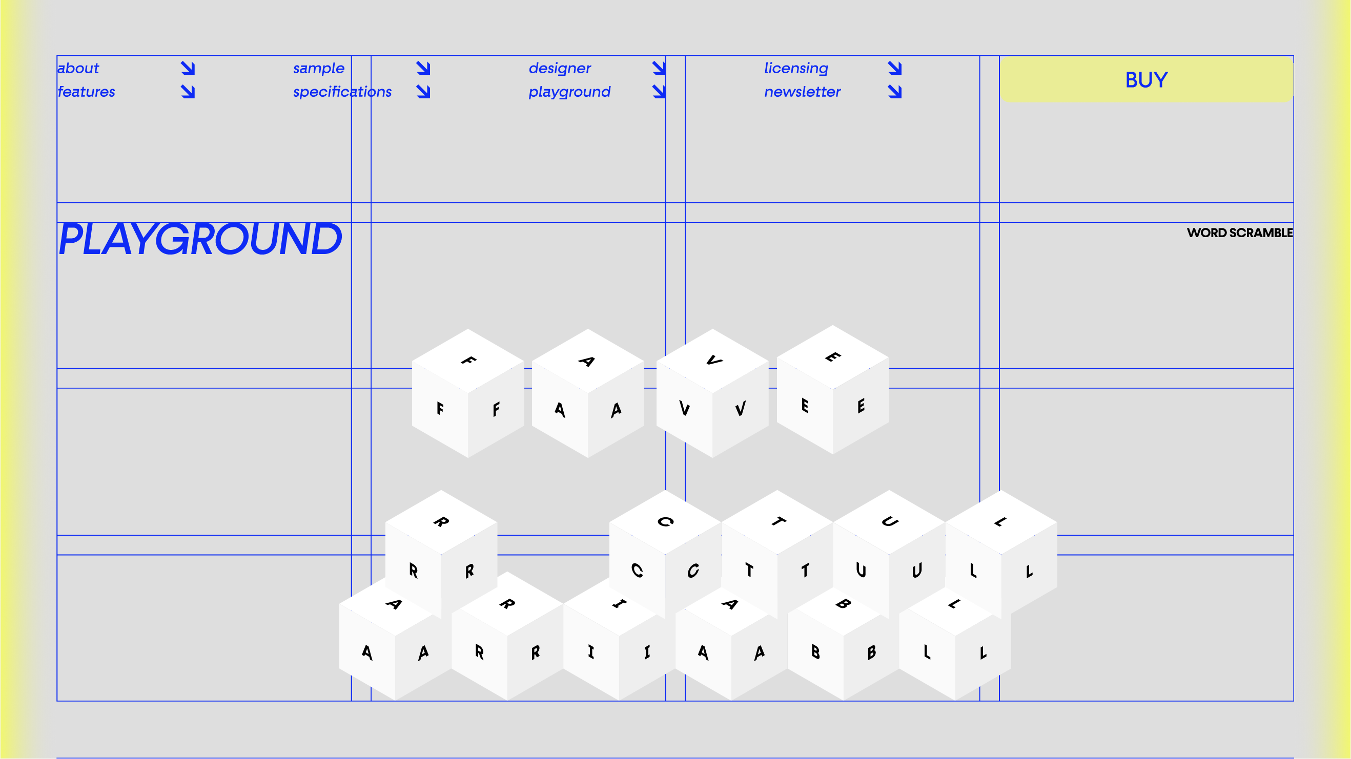
Two visual directions were explored: Neo-Brutalism and Blueprint. The Neo-Brutalism concept uses a black, grey, and white palette with neon yellow accents, featuring geometric shapes and halftone photography aligned to a grid system inspired by brutalist architecture. The Blueprint direction draws from architectural drawings with a blue, cream, and grey palette, sharp-edged elements, and duotone photography with diagonal navigation arrows that reference technical documentation. Both approaches were ultimately merged to create a hybrid design that combines the strengths of each direction.
Implementation
The Figma prototype was designed for both desktop and mobile experiences, using a modular grid system with Bauhaus and Swiss style influences. Key sections include About, Features, Specifications, Designer, Sample, Playground, Licensing, and Newsletter signup. Large typography, gradient backgrounds, and a brutalist color palette emphasize the font's geometric nature. Moving type videos showcase the variable font technology—offering complete weight control from hairline to black—and demonstrate the typeface's versatility for digital applications and contemporary design work.